Georgia School Grades Reports and CCRPI Comparison.png

An official website of the State of Georgia.
The .gov means it’s official.
Local, state, and federal government websites often end in .gov. State of Georgia government websites and email systems use “georgia.gov” or “ga.gov” at the end of the address. Before sharing sensitive or personal information, make sure you’re on an official state website.
Still not sure?
Call 1-800-GEORGIA to verify that a website is an official website of the State of Georgia.
June 26, 2017
By Polina Aleshina
The GOSA Data Dashboards provide stakeholders, educators, parents, and students with data on Georgia public K-12 schools, technical colleges, and colleges/universities. The five data dashboards currently available are the Georgia School Reports, High School Graduate Outcomes, Georgia Higher Learning and Earnings, Schools like Mine, and the Interactive Education Data Map. Each dashboard provides a unique, interactive view of Georgia public education, such as details on how high school students fare after graduation, the median salaries of technical college and college/university graduates, and how schools with similar characteristics compare academically. This education update outlines the function and features of the available GOSA Data Dashboards.
The Georgia School Grades Reports provide concise school reports for all public elementary, middle, and high schools and school districts in Georgia. These reports include A-F letter grades based on school performance, as well as performance on statewide assessments, school demographics, the graduation rate, and other academic information. Users can also compare their search with other schools or districts and can reference the Schools Like Mine dashboard to help guide their search. Information on the data can be accessed by clicking on the question marks to the right of the headings or by accessing the reference page. Users can download a PDF of the information by clicking on the “Download PDF” button at the bottom of the page. The site is also available in Spanish.
The Georgia Higher Learning and Earnings (GHLE) dashboard provides information on earnings for Georgia technical college and college/university graduates who work in Georgia for the first and fifth years after graduation. Users can view information by program of study/major, degree type, and Georgia public technical college or college/university. The dashboard also provides earnings information for the most popular and highest earning degrees, allows for comparison between differing degree types, programs of study, and/or colleges, and includes a section on the highest earning and most popular programs of study statewide.

To begin, users select a degree type, which populates the choices in the other fields. To repopulate the field, the user can either reselect 'Choose a Degree Type' or click the 'Clear Selection' button near the bottom of the page. The dashboard displays summary information about the median earnings after one and five years after graduation and how the specified major compares to other majors within the same degree type. For example, selecting statewide results for a Bachelor’s in Computer and Information Sciences produces the following:


Users can also compare two different degrees, programs of study, or colleges with the ‘Comparison Tool’ tab. This tool displays information about the difference in earnings between the two choices with bar graphs.
More information on the dashboard can be found in an accompanying research report or the GHLE snapshot.
The High School Graduate Outcomes dashboard provides information on the paths that public high school graduates take after graduation.
The dashboard generates the following information:
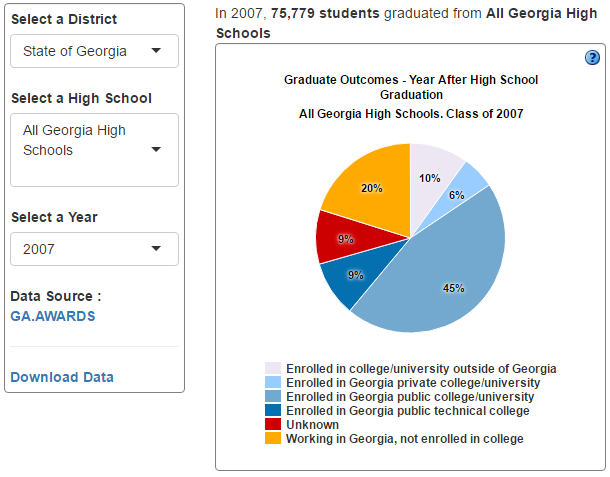
The dashboard initially shows statewide data. Users can narrow down the data by selecting a specific district, high school, and graduating class year. Users can also access more information about the data by clicking the blue question mark in the right corner of each section’s title, or by accessing the Calculation Guide .
Schools like Mine DashboardThe Schools Like Mine dashboard allows parents, educators, and community members to find schools with similar student populations to their school. It also lists the school’s letter grade and College and Career Readiness Performance Index (CCRPI) score to allow for comparison of performance between the “like” schools. The dashboard prompts users to select a district, school, grades served, and two comparison criteria. This dashboard lists up to seven similar Georgia public schools based upon the criteria selected and up to five schools based upon all criteria in the list. Users have the option to sort data by district, school, letter grade/CCRPI, number of enrolled students, percent of economically disadvantaged students, percent of students with disabilities, percent of English Language Learners, and race/ethnicity. The school's letter grade and CCRPI score are listed only for reference and are not included in the selection criteria. |
Figure 6: Schools Like Mine Search ToolSchools Like Mine Search Tool.png

|

The Interactive Education Data Map includes district-level data on student mobility, student demographics, standardized test performance, CCRPI scores, and community demographics. The dashboard is composed of three visible graphics: a scatter plot, a map of Georgia school districts, and a color-coded key. Users can minimize, maximize, or rearrange the fit of each of the three windows and can hover over or click on specific areas of interest to see exact values of a specific district.
The Explanation of Variables Included in the Interactive Education Data Map provides further explanation of the map’s capabilities and elaborates on what data are used in map creation.
Moving forward, GOSA will continue to refine and update the data dashboards with new data, insights, and features. GOSA is committed to providing parents, students, and community members with easy-to-understand information on public education and plans to develop new dashboards in the coming months.